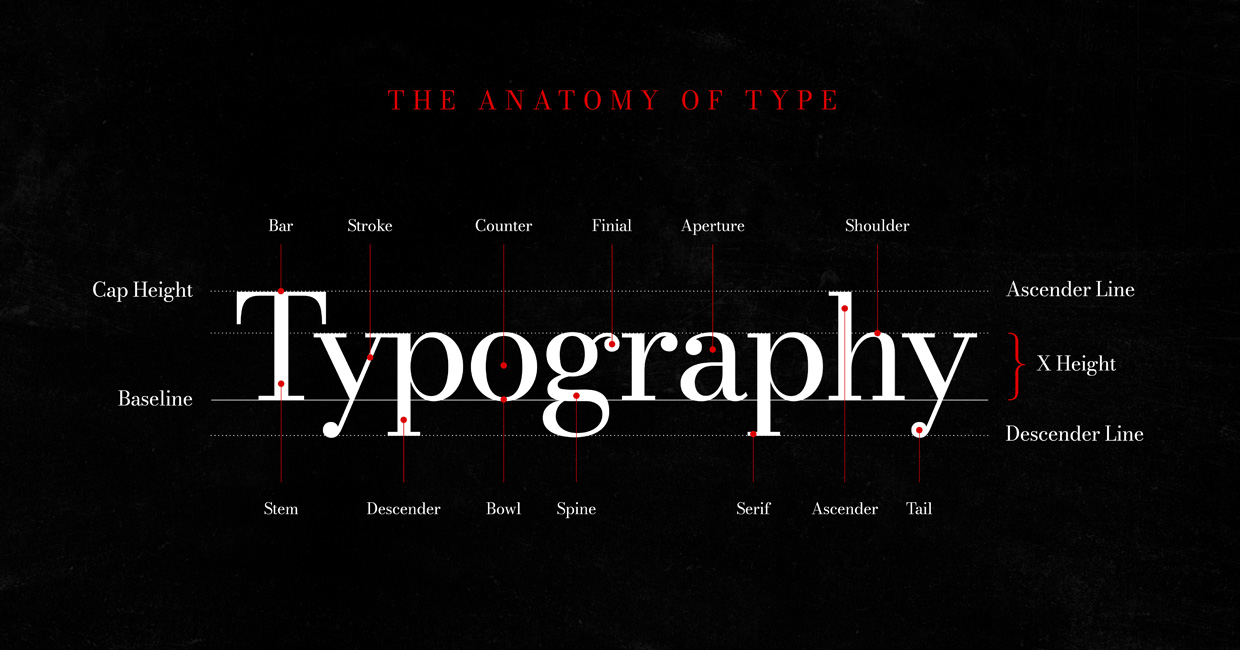
Typography is more than choosing a font. It is the careful balance of form, proportion, spacing and detail that shapes how a message looks and feels. From editorial layouts to brand identities, understanding how letters are constructed gives designers greater control over visual communication. For those new to design, learning typographic anatomy provides a foundation for making confident design decisions. For experienced designers, revisiting these fundamentals offers a fresh appreciation of the subtle details that distinguish functional typography from exceptional typography. This article breaks down the essential components of letterforms, the invisible guidelines that govern their proportions, and the spacing principles that bring them together. Let’s explore each element and understand how it contributes to effective typography. 1. The Anatomy of a Letterform Every letter is made up of distinct structural components. Although these details are rarely noticed individually when reading, they determine a typeface’s character, balance and legibility. Let’s… read more

Graphic Design
More Posts
- The Anatomy of Typography: Understanding the Building Blocks of Great Type
- Words to Live By: Beautiful Quotes and Phrases About Love, Home and Family
- PowerPoint Transitions: Every Effect Explained
- Canva Templates: The Ultimate Guide to Designing Faster and Smarter
- The 5 Best CapCut Alternatives in 2026
Adobe Stock Search
Please use the search form below to find footage and video templates directly from Adobe Stock.
Great Value Packs

Sponsored Resources