Typography is more than choosing a font. It is the careful balance of form, proportion, spacing and detail that shapes how a message looks and feels. From editorial layouts to brand identities, understanding how letters are constructed gives designers greater control over visual communication.
For those new to design, learning typographic anatomy provides a foundation for making confident design decisions. For experienced designers, revisiting these fundamentals offers a fresh appreciation of the subtle details that distinguish functional typography from exceptional typography.
This article breaks down the essential components of letterforms, the invisible guidelines that govern their proportions, and the spacing principles that bring them together.
Let’s explore each element and understand how it contributes to effective typography.
1. The Anatomy of a Letterform
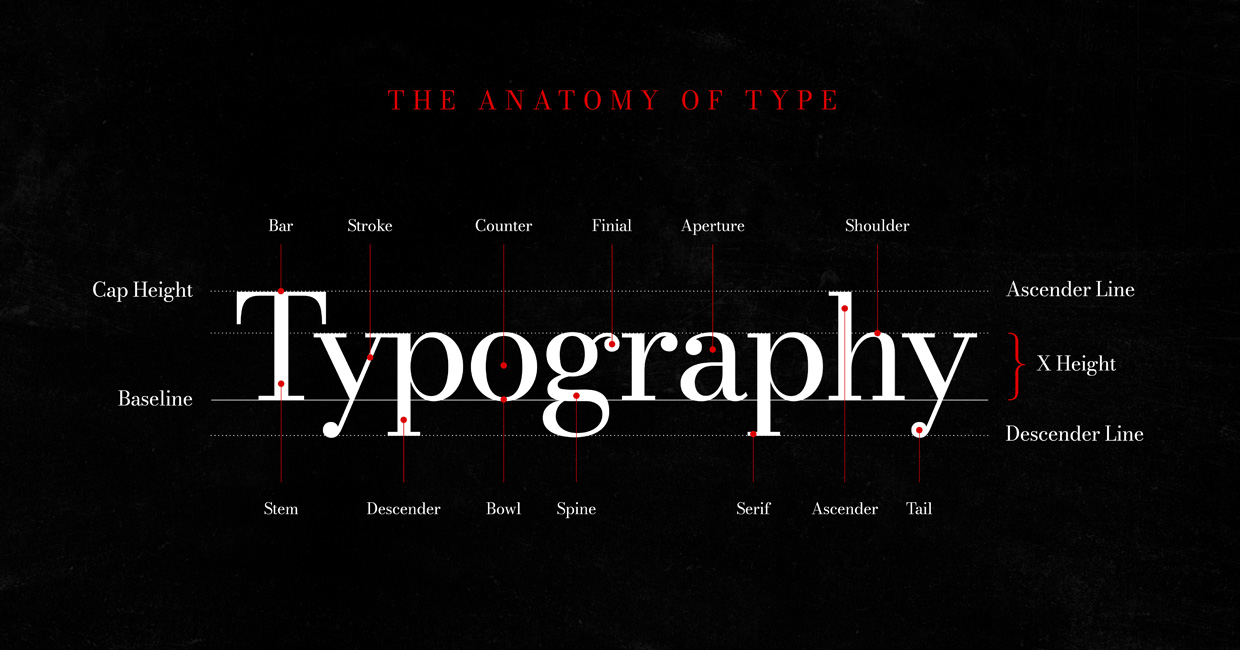
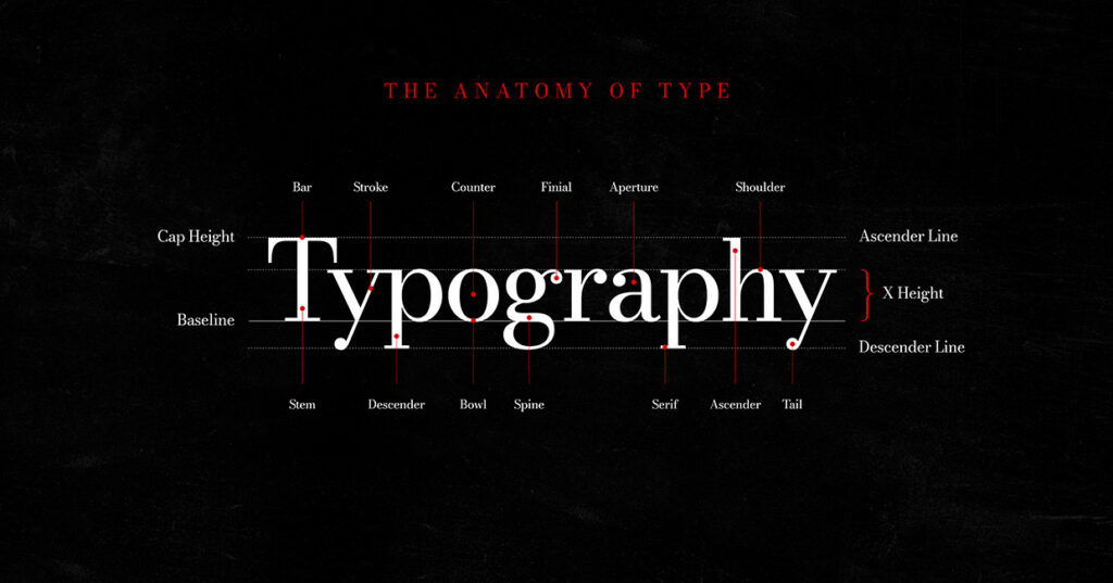
Every letter is made up of distinct structural components. Although these details are rarely noticed individually when reading, they determine a typeface’s character, balance and legibility.
Let’s identify several key elements:
- Bar: A horizontal stroke connecting or crossing parts of a letter, as seen in A, E and H.
- Stroke: The fundamental line forming a letter. Strokes can be vertical, horizontal, diagonal or curved, with variations in thickness contributing to a typeface’s personality.
- Counter: The enclosed or partially enclosed negative space within a letter, such as the interior of O, P or B. Its size affects legibility.
- Finial: A tapered or curved terminal at the end of a stroke, often found in letters such as a, c and f.
- Aperture: The opening of a partially enclosed letterform, particularly visible in C and e. Wider apertures can improve readability at smaller sizes.
- Shoulder: A curved stroke that rises from a stem, commonly found in lowercase h, m and n.
Together, these components create the distinctive shapes that allow us to recognise individual characters and differentiate one typeface from another.
2. The Invisible Guidelines of Typography
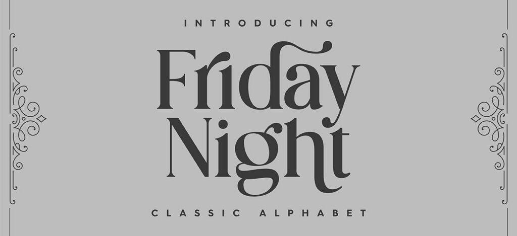
Letterforms are constructed around a series of invisible horizontal guidelines. These establish their height, alignment and proportions, ensuring consistency across a typeface.
These are the five essential measurements:
- Cap Height: The height of uppercase letters, measured from the baseline to the top of a flat capital such as H.
- Baseline: The imaginary horizontal line on which most letters sit. It provides the foundation for consistent text alignment.
- X-Height: The height of the main body of lowercase letters, measured using the letter x. It has a significant influence on a typeface’s appearance and perceived size.
- Ascender Line: The upper extent of lowercase letters with ascenders, such as b, d, h and k.
- Descender Line: The lower extent of letters with descenders, such as g, p, q and y.
These measurements influence the proportions of a typeface, its visual rhythm and how comfortably text can be read. For example, a larger x-height can make lowercase letters appear more prominent, while longer ascenders and descenders contribute to a typeface’s overall character.
Understanding these guidelines is particularly useful when comparing fonts and establishing typographic hierarchies.
3. Exploring the Structural Details
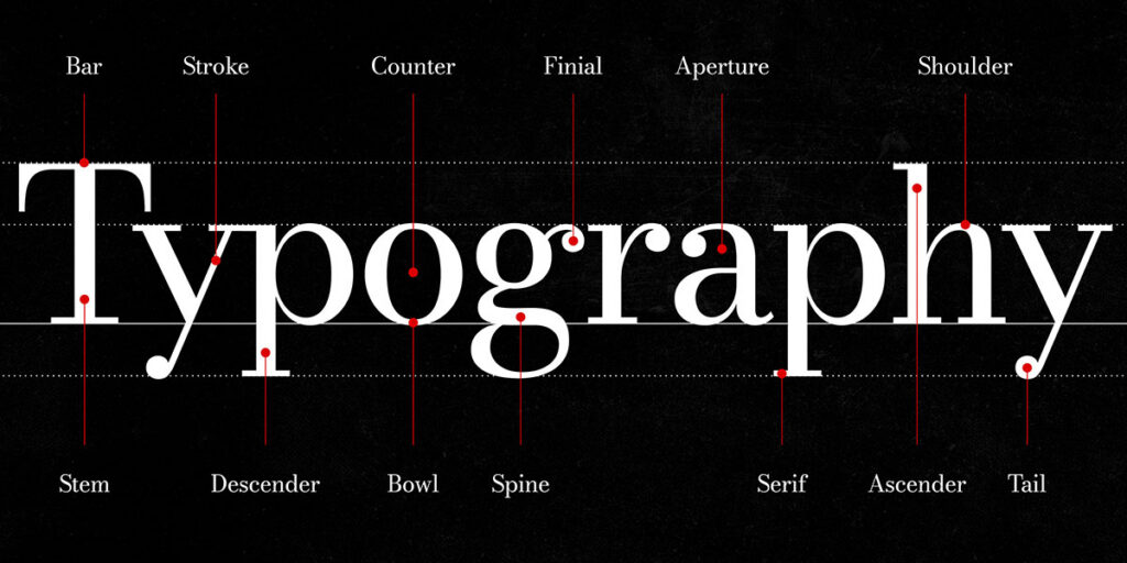
Beyond the primary measurements, individual letters contain additional features that contribute to their construction and visual identity.
These details include:
- Stem: The main vertical or diagonal stroke of a letter, providing much of its structural strength.
- Descender: The portion of a lowercase letter extending below the baseline.
- Bowl: A curved stroke enclosing or partially enclosing a space, as seen in b, d, o and p.
- Spine: The principal curved stroke running through the letter S.
- Serif: A small finishing stroke at the end of a letterform, characteristic of serif typefaces.
- Ascender: The part of a lowercase letter extending above the x-height.
- Tail: A descending or curved finishing stroke found in certain characters, including Q, R and y.
While some of these features are shared across many typefaces, their proportions, curvature and weight can vary considerably. These differences are what give individual typefaces their distinctive appearance.
4. The Importance of Spacing: Kerning, Tracking and Leading
Typography is defined not only by the shapes of letters but also by the spaces between and around them.
Three fundamental spacing principles determine how text is arranged and experienced.
Kerning: Spacing Between Individual Letters
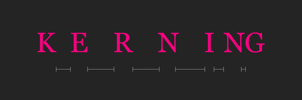
Kerning is the adjustment of space between specific pairs of letters to create a visually balanced result.
Certain combinations naturally produce awkward gaps because of their shapes. Adjusting the spacing between them creates a more consistent appearance.
Kerning is particularly important in logos, headlines and large display typography, where even small inconsistencies become noticeable.
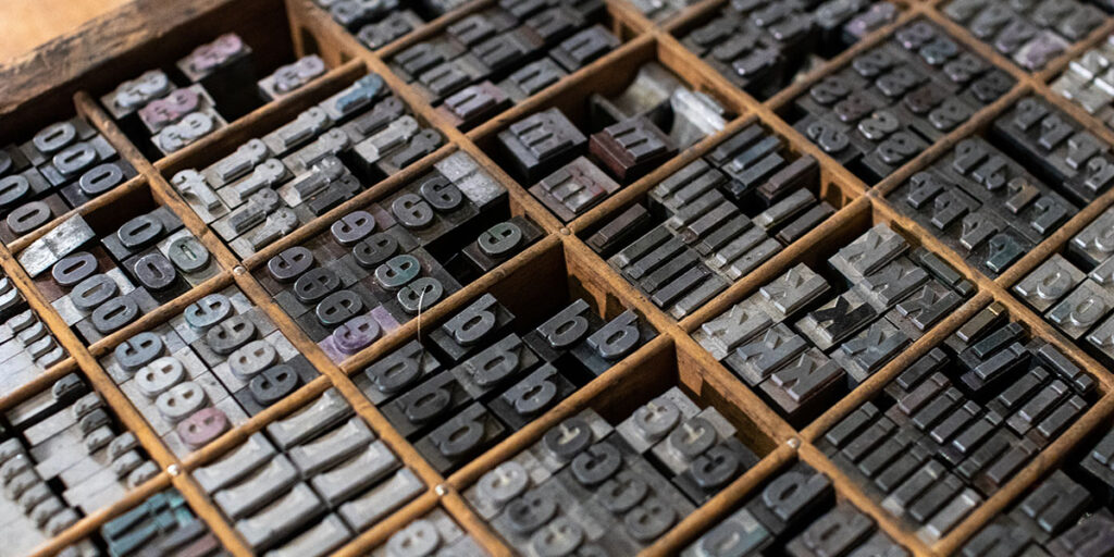
ORIGIN – Kerning developed in metal typesetting, where letters were physically adjusted to fit closer together and create balanced spacing.
Tracking: Overall Letter Spacing
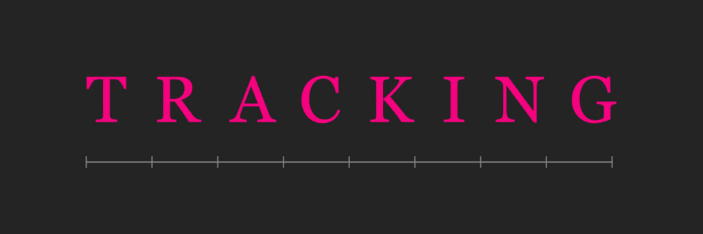
Tracking refers to the overall spacing applied across a selection of text.
Increasing tracking creates a more open appearance, often used in uppercase headings, while reducing it produces a tighter, more compact arrangement.
The objective is to establish visual balance without compromising readability.
ORIGIN – Tracking emerged with modern typography and phototypesetting, allowing consistent spacing adjustments across entire words or blocks of text.
Leading: Vertical Spacing Between Lines
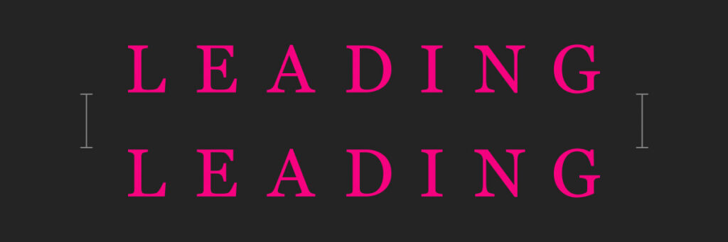
Leading describes the vertical spacing between lines of text.
Too little leading can make paragraphs feel crowded, while too much can disrupt reading flow. The ideal amount depends on font size, typeface, line length and the intended layout.
Careful leading creates comfortable, readable text and helps establish a clear visual hierarchy.
ORIGIN – Leading originated in traditional typesetting, where strips of lead were placed between lines of metal type to control vertical spacing.
5. Applying Typographic Anatomy to Design

Understanding typographic terminology is valuable, but its real benefit comes from applying it to practical design decisions.
When selecting a typeface, consider its proportions, stroke contrast, counters and apertures. These characteristics help determine whether it will work effectively in a particular context.
For example, a typeface with open apertures and generous counters may be suitable for smaller text, while a high-contrast serif with refined details might work better for an editorial headline or luxury brand identity.
Likewise, understanding spacing allows designers to move beyond default settings and refine the relationship between letters and lines.
These principles are particularly relevant to:
- Brand identity: Creating distinctive wordmarks and consistent typographic systems.
- Editorial design: Establishing readable layouts and engaging headline treatments.
- Web design: Improving legibility across different screen sizes.
- Packaging and advertising: Balancing visual impact with clear communication.
The key is to consider typography as a complete system rather than a collection of individual design choices.
Final Thoughts
Great typography is built on an understanding of detail. The shape of a letter, the proportion of its components and the space surrounding it all contribute to how effectively it communicates.
Whether you’re learning the fundamentals or refining an established design practice, understanding typographic anatomy provides a stronger foundation for working with type.
It’s not simply about choosing a beautiful font. It’s about understanding how letters are constructed, how they work together, and how small details create a meaningful visual experience.
Bring the Anatomy of Typography to Your Workspace
If you’re passionate about typography, graphic design or the finer details of letterforms, why not make it part of your everyday creative environment?
Inspired by the anatomy of type, this design transforms the essential terminology of typography into a striking visual reference. Featuring clearly labelled letterform components, typographic guidelines and spacing principles, it celebrates the structure and craft behind great type.
Set against a textured black background, with elegant white lettering and contrasting red annotations, the design is both an educational reference and a distinctive piece of graphic art.
Available as desk mats, mouse pads and art prints/posters, it’s a great addition to a designer’s workspace, creative studio or home office. Whether you’re a graphic designer, design student, typographer or simply someone who appreciates the art of lettering, it’s a stylish way to keep the fundamentals of typography close at hand.
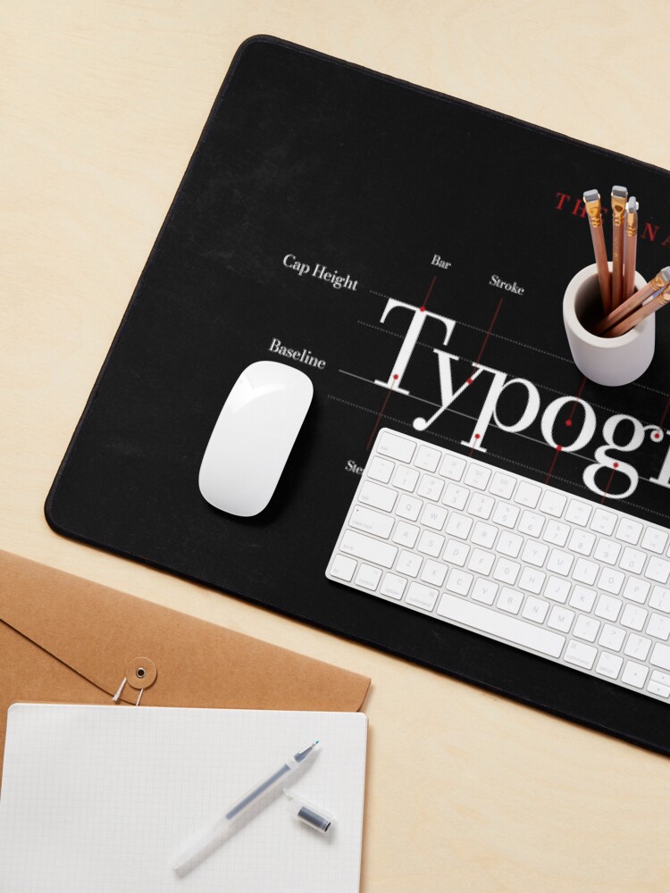
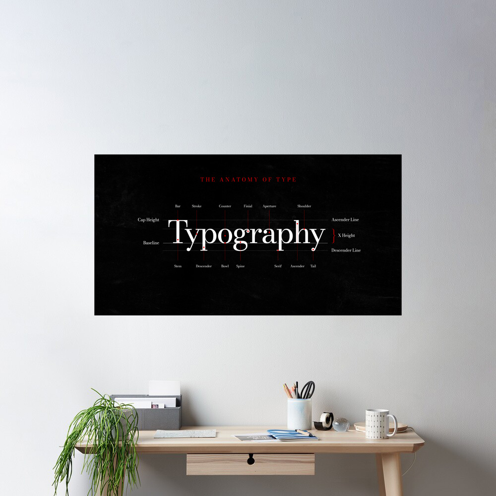
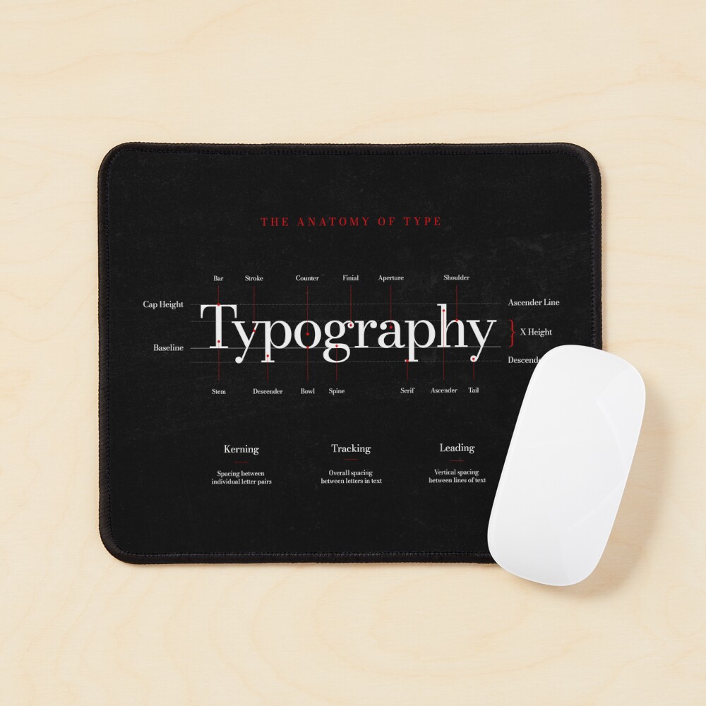
Explore the Anatomy of Typography collection on Redbubble and find a design that brings your passion for type to life.
Have you discovered our magnetic posters?
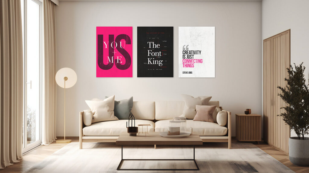
We’re excited to have partnered with Displate, the leading online destination for premium metal art, to bring our designs to your walls in a whole new way!
No nails, no tools, no frustration! Displates feature an ingenious magnetic mounting system, so you can put them up in seconds – with no tools, no fuss and no damage to your walls.
Give your walls an upgrade!
Explore our Displate store and find your next favourite design here!